
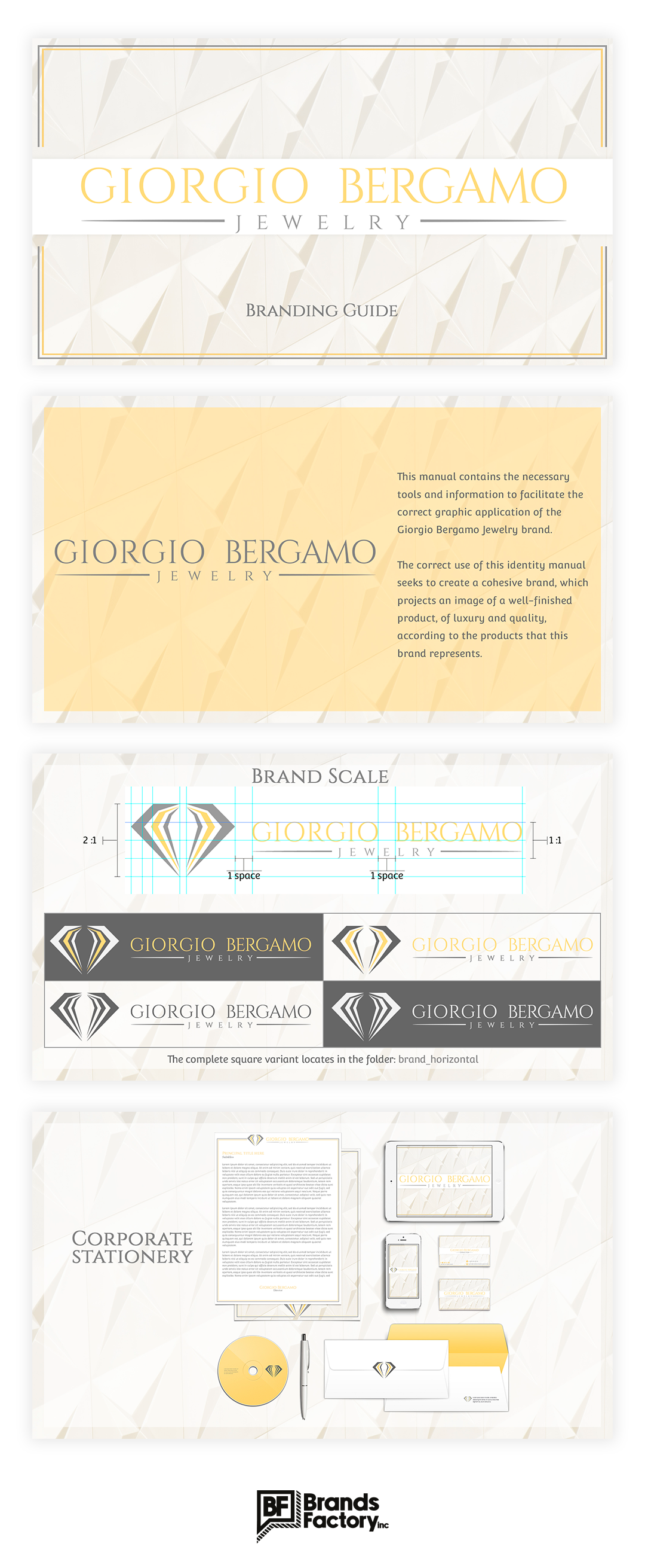
For this project, the brand identity and branding guide for the luxury jeweler Giorgio Bergamo was carried out, allegorical elements were used as a reference to the metallic materials with which the garments are made, gray and gold tones given that most of the its catalog is made of stainless steel and gold, for the typography a serif style font was used in allusion to the ornate shapes of its garments and a diamond that relates to its first visual identity that marks a connection between the past and the future.
The manual included: template for social networks, typography, logo in its respective variants, stationery material, facebook cover, instagram, the style guide according to the use and the respective hierarchy of information, graphic styles, pattern, backgrounds and proportion of the color.
For the visual identity, accent elements present in the South American culture and a handwritten style typography were used.
Since the store was located in the State of Florida (USA), the use of bright colors also served to connect the establishment with the local culture of the state, who are the target market of this brand.
A serif style font was used to give it elegance and sobriety at the same time, without losing legibility, a diamond with thin strokes was used to be related to its first logo, achieving a connection with the brand’s trajectory.