Giorgio Bergamo Brand Guide
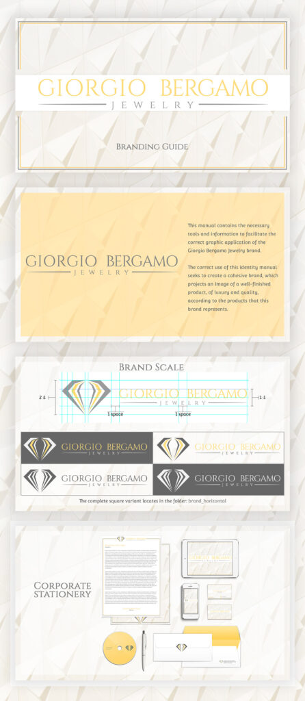
This guide developed for the luxury jeweler Giorgio Bergamo, for this case study we carried out an exhaustive investigation, where the gray color was used as a reflection of the steel used as a base in most of its garments, and the gold present in many of the accessories , white acts as a color of connection and base to give prominence to the jewels.
A serif style font was used to give it elegance and sobriety at the same time, without losing legibility, a diamond with thin strokes was used to be related to its first logo, achieving a connection with the brand’s trajectory.


